6 Creative Design Tips for Making an Attractive Flyer
- Put your Flyer Design Elements in Contrast with Each Other
- Make all the Design Elements Comply with One Focal Point
- In Colors We Trust
- Arrange Design Elements in Your Flyer According to the Rule of Thirds
- Make Your Flyer Design Balanced and Easy-to-Read with White Space
- Use the Right Fonts in the Right Place at the Right Time
- Bottom Line
Earlier, we explained in a simple step-by-step guide how to create a flyer template in Photoshop. If you have mastered the basic principles of a flyer design, let’s work on your flyers design appeal. Here are 6 professional graphic design recommendations for making an attractive flyer design.
Put your Flyer Design Elements in Contrast with Each Other
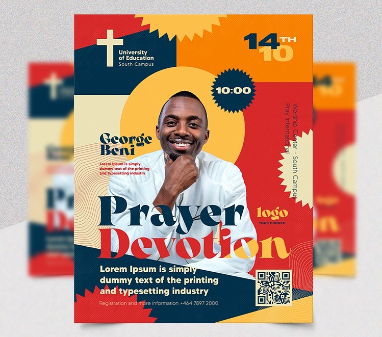
Contrast is an important design principle which helps emphasize key elements and focal points in the graphic design. It helps to structure and build a hierarchy by creating a focus on one element. If you want your flyers’ design stand out, use contrast in colors (high, low contrast colors), fonts (types and sizes), backgrounds, shapes etc. Learn more about the contrast in graphic design and start to apply it in your flyer design.
Make all the Design Elements Comply with One Focal Point
Don’t create a fuss in your flyer design by making a focus on too many design elements. It distracts and the key message of a flyer can be lost in a busy flyer design. Use one focal point and arrange the rest of the secondary elements around it. Use one high-resolution and relevant photo or image that best communicates the bottom line of the flyer. Look at the below flyer template, you can clearly see that the football outfit make a focal point. Nothing extra, the key message is in focus and the rest of the elements complement the focal point.
In Colors We Trust
Colors are no less important in graphic design. Colors are applied to every element in graphic design and the color you choose affects the overall mood of the design. When it comes to choosing colors for your flyer design, you should consider 3 things:
- How this or that color affects human emotional state and behavior;
- How this or that color fits the business objective the flyer is created for;
- How the colors fit each other (if they complement or conflict each other).
In today’s marketing world, colors affect people’s emotions, motivation, and even behavior and you should treat colors as psychological levers for creating particular emotions which lead to desired actions.
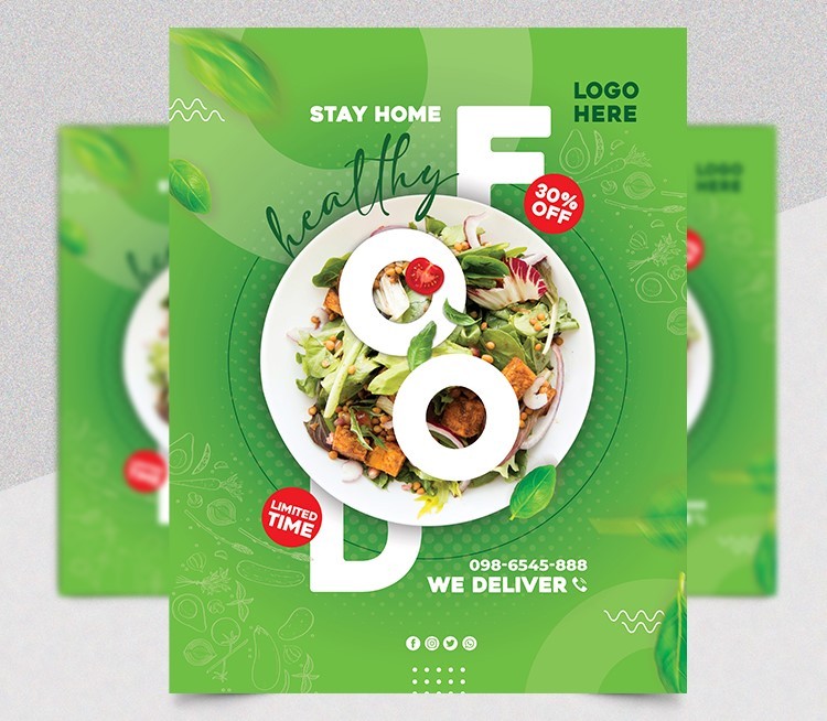
Another simple rule for choosing colors for your flyer design is to stick to 2-3 colors and choose only those color options which complement each other. Creating a color scheme is hard, so you will need some helpful tools for choosing a perfect color scheme.
Another important tip: use eye-catchy colors to make important elements (e.x: a call-to-action) stand out and use neutral colors for the elements of secondary importance.
Arrange Design Elements in Your Flyer According to the Rule of Thirds
An old golden rule of thirds works for all types of design and a flyer design is no exception. The rule of thirds helps to arrange the focal elements of a flyer design in the most visible areas. What are those visible areas?
These are 4 intersections of the horizontal and vertical lines of the grid. You should place the most significant elements (images, call-to-actions) as close as possible to these intersection points. Another important rule of content reading is that people read information in the F-shaped direction. It means that most of the people’s attention is set to the top left info first, then the bottom left, then the top right and the bottom right.
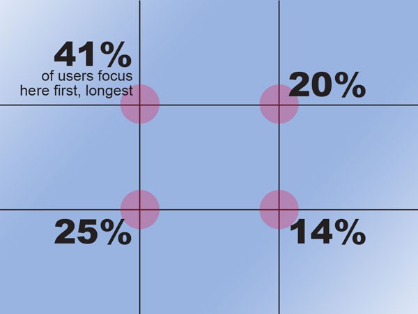
Image source: designmodo
Make Your Flyer Design Balanced and Easy-to-Read with White Space
White space is an empty room around design elements. When used little white space between design elements, it creates a busy cluttered feeling. Give your graphic elements more breathing room in order to help people’s eyes move smoothly from one area to another and read the information easily.
Use the Right Fonts in the Right Place at the Right Time
Each font has its own specific style, the purpose of usage and field of application. For example, there are display typefaces which are used for titles and headlines only and they should never be used for body copy. There are fonts which are used for body text only, as they are legible, but they don’t work at all for titles and important text highlighting. Typography is a huge art and it requires an in-depth engagement. There are a lot of graphic designers whose focus area is typography. If you a looking for good fonts for flyers template design, we have got you covered.
Bottom Line
It may take some time to reach the balance in a design of your flyers. You should remember that a good-looking flyer has a balance of high-quality imagery, clear message and clean design.

