How to Find the Right Font + 20 Free Fonts for Flyers & Brochures
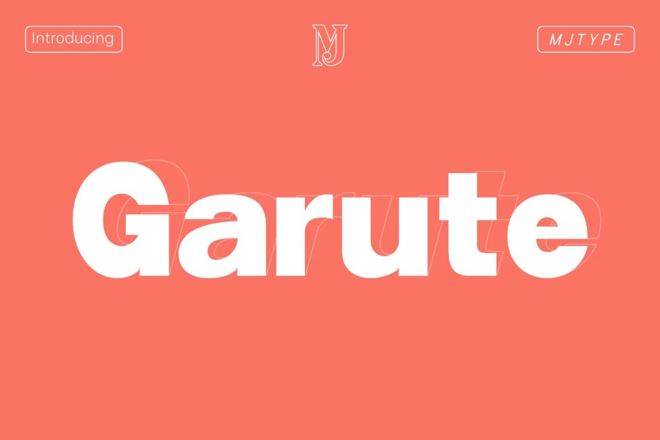
- Garute - Free Variable Sans Serif Font
- Stopwatch Free Typeface
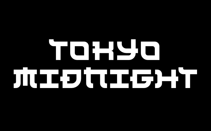
- Tokyo Midnight
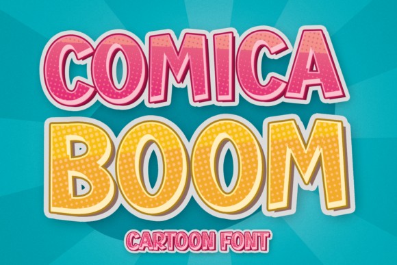
- Comica Boom Font
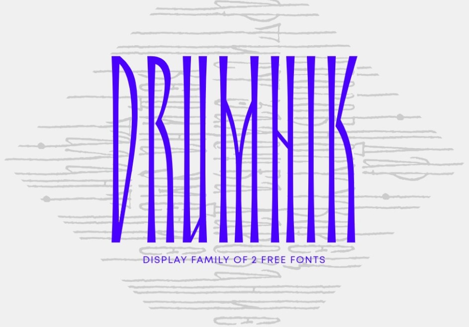
- Drumnik Font
- Ananda Black Font
- Volja Font
- Playen Sans - Free Condensed Font Family
- Mattilda Script Font
- Soda Berry
- Witch Mystery Font
- Dx Bloop Colorful Free Font
- NAMU Old Style
- PLAYFAIR DISPLAY
- Jiro Free Typeface
- Relocation Font
- Project Space Font
- Glowbloom Font
- Orion Font
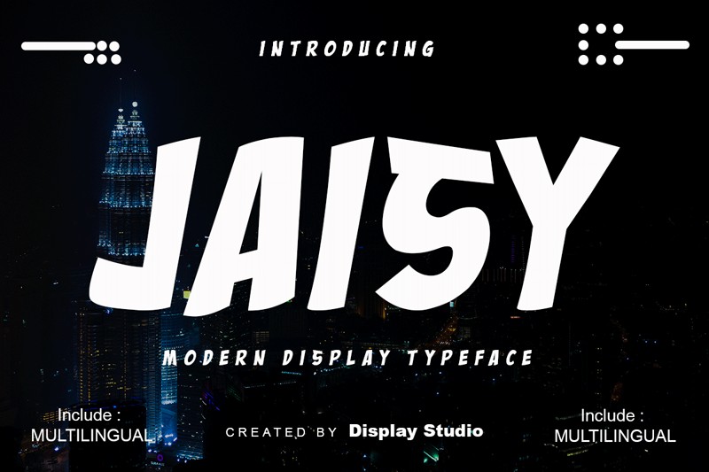
- Jaisy Font
The font choice directly depends on design, objective and the key message of a printed material. To make this vague statement more clear, let’s have a closer look at the factors which help to choose the right fonts for your flyers and brochures templates which make them stand out and easy-to-read at the same time.
How to Find the Right Font for Flyer and Brochure Templates?Recently, I have come across a fascinating infographic that helps you choose a typeface based on a design project you need a typeface for.
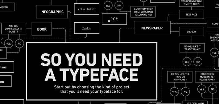
Though this inforgraphic provides font solutions to a wide range of design projects, it doesn’t explain the basics of choosing this or that font for a flyer or brochure.
- Use fancy and bold fonts for headlines and plainer typefaces for body copy.
Headlines in flyers should stand out from the body text, so people could catch the general idea of the whole text that comes below headlines. Eye-catching fonts are justified here. Use bold and prominent fonts in order to put emphasis on important information that should attract people’s attention in the first place. While fonts for body text should be plain, simple and easy-to-read. Keep with medium weight (thick) fonts to make it easy-to-read, as lightweight fonts are too transparent.
- Don’t use too many fonts per one flyer or brochure.
Less is better. Stick to 2-3 fonts. If you want to play with more than 3 fonts than it’s better to consider fonts from one typeface family. Each font has its own “personality”, some fonts are “extroverted” and some are “introverted”. They should not conflict but complement each other. If you are not sure if the chosen fonts are compatible and work well together, use the fontpair service. Learn how to combine fonts in your design projects.
- Fonts for flyers and brochures must be legible
Prior to working with fonts for your flyer or brochure templates design, make sure that the chosen fonts render well both on your computer and in print.
- Match font type to the tone (fun and exciting, emotional etc.) and design (elegant, minimalist, retro, modern etc.) of a brochure or flyer.
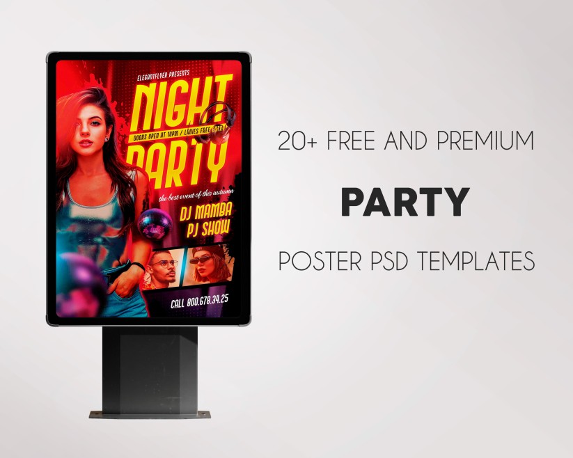
If it’s an official business flyer than you should use some strict free fonts. Fancy fonts are appropriate for flyers which promote parties and other non-formal events.
We have selected best 20 free and premium typefaces which you can download right away and use for personal and commercial purposes in your flyer and brochure templates.
Garute - Free Variable Sans Serif Font
Stopwatch Free Typeface

Tokyo Midnight
Comica Boom Font
Drumnik Font
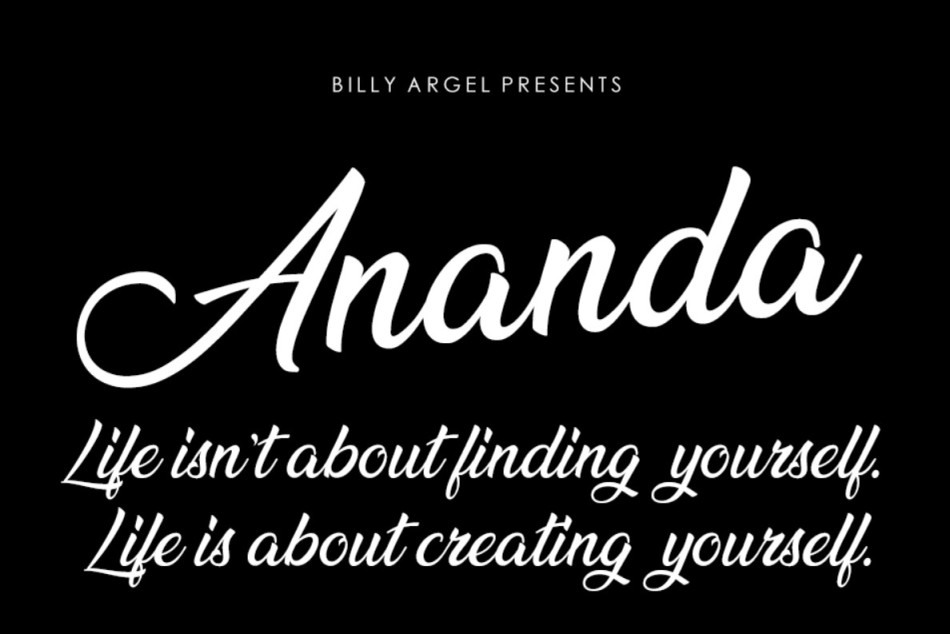
Ananda Black Font
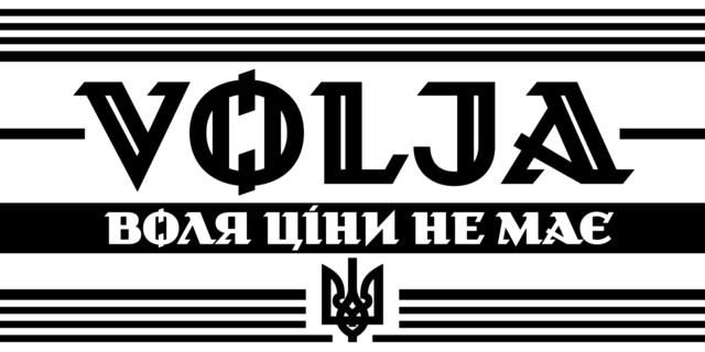
Volja Font
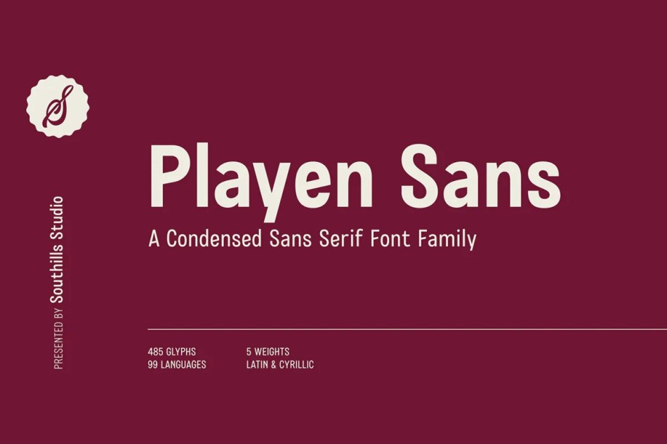
Playen Sans - Free Condensed Font Family
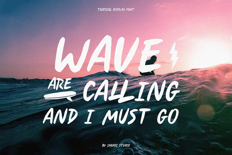
Mattilda Script Font

Soda Berry
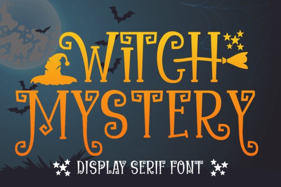
Witch Mystery Font
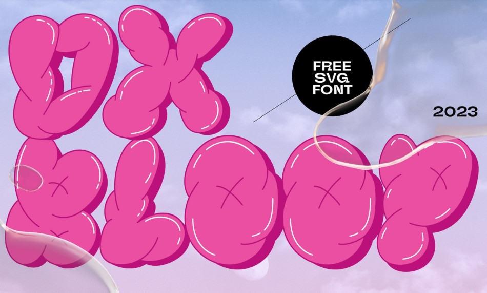
Dx Bloop Colorful Free Font
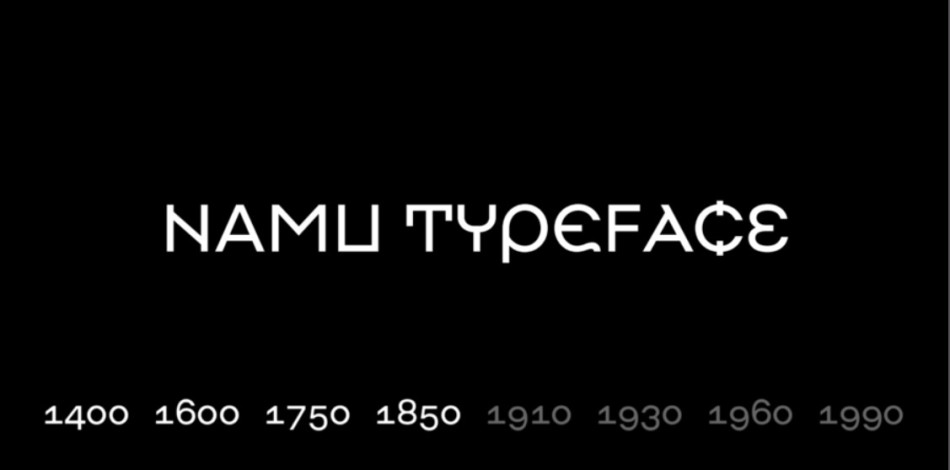
NAMU Old Style
PLAYFAIR DISPLAY

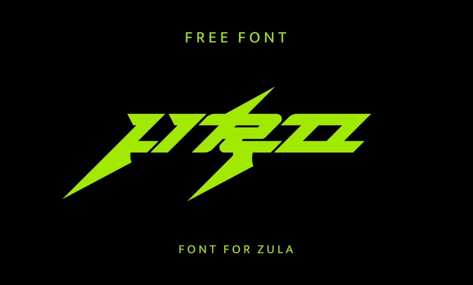
Jiro Free Typeface
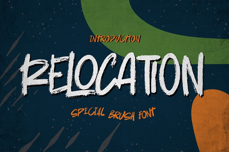
Relocation Font
Project Space Font

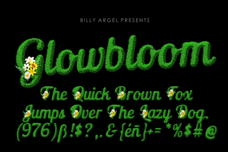
Glowbloom Font
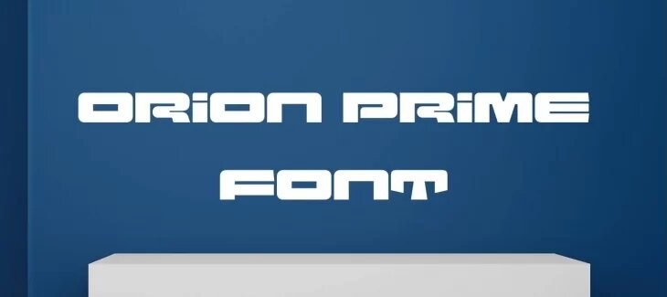
Orion Font
Jaisy Font
